In short
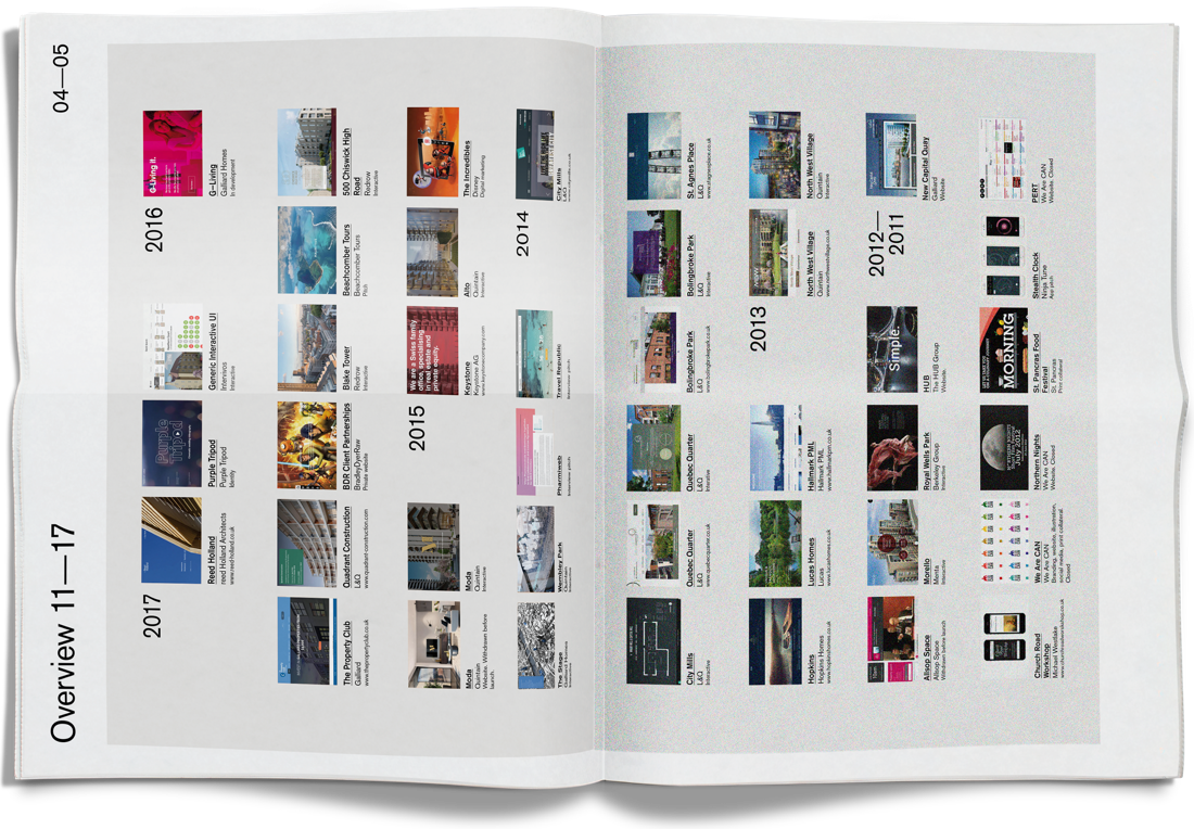
From 2012 to 2017 I was a senior designer at BDR, a London agency whose clients were mostly property developers: Galliard, Redrow, Quintain, L&Q and Berkeley Group among them. Before that I freelanced, for architectural practices, a London start-up, St Pancras International and Samsung.
Most of the work sold homes before they were built. A buyer reserves an apartment from a floor plan and a computer-generated view, so the website and the marketing suite have to do what a finished building can't yet. I worked on about 20 of these schemes. The websites had one job, and they did it: the schemes sold out within weeks, some with homes over £1 million, and the sites were retired.
I also designed touchscreen interactives for the marketing suites, which a sales team hands to a buyer to explore the building, the apartments, the views and the area. I'd trained and worked as an architect, so plans, views and transport links were familiar ground. Andy Rose, the agency’s developer, hand-coded every one, and we worked hand in glove: I designed, Andy built, and we refined each one together.
Alto: Sold out in an evening
Alto was the first phase of Quintain’s new homes at Wembley Park: over 100 apartments, from about £450,000 on the lower floors to over £1 million for the upper floors and penthouses. I designed its website and the touchscreen interactives for its marketing suite.
At the launch event in September 2015, buyers used them to choose their apartments and bought them there and then. The first phase sold out that evening: about £90 million of homes in one night.
Blake Tower: A sales suite in a listed building
In 2016 Redrow, one of the UK’s largest housebuilders, was turning Blake Tower, a Grade II listed block in the Barbican, into 74 apartments and penthouses, priced from £695,000 to £1.55 million. Its marketing suite needed a touchscreen sales tool that felt as considered as the apartments and that any buyer could pick up.
Buyers find an apartment floor by floor, then open its plan, which zooms and pans, and the view from its windows, by day and by night. The menu stays out of the way until it’s needed. Availability came live from Redrow’s own database, and it ran on Microsoft Surface tablets in kiosk mode.
Redrow then commissioned interactives for two more developments, 500 Chiswick High Road and Morello.
Keystone: Swiss, and shorter
Keystone, a Swiss family office investing in property and private equity, with offices in Switzerland, Luxembourg and the UK, wanted a new website, designed for phones first, that kept its brand and felt unmistakably Swiss.
I cut the structure back first: fewer sections, and fewer steps to reach anything. Then a strict 12-column grid, with large photographs and horizontal rules to pace each page. Helvetica throughout, and only red, black and white, with red marking what you can press. I designed it in 2015, and it’s still live: keystonecompany.com.